BRANDING
is my business
Soheyla Adib | Brand Identity Designer
How can I increase sales in such a crowded market?
How can I make my brand stick in customers’ minds?
How can I make choosing my business easier for customers?
Why am I still not getting the visibility I deserve despite all my efforts?
Why are some of my competitors selling more than I am?
Questions you may have asked yourself many times
Brand Identity Design
Fragrance
Characters
Graphic Elements
Motion
Signage
BRAND
IDENTITY IS
Tone of
Voice
Website
Color
Logo
Type
Packaging
Uniforms
Images
Jingles
Messaging
Illustration
Ads
Apps
Interior
Symbol
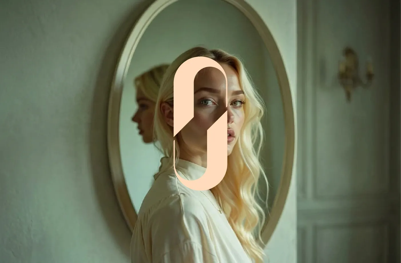
The Feminine Face; A Human Expression of Beauty
At the heart of the Haleh logomark is a feminine face, drawn with minimal lines yet rich in meaning. It is not the portrait of one woman, but a universal reflection of many women each on her own journey toward a more confident, conscious, and authentic self.
The mirrored form adds depth to the symbol, suggesting the many layers of feminine identity: who we are, who we are becoming, and the parts of ourselves waiting to be revealed.
Its simplicity is intentional. By leaving space for personal interpretation, the mark invites every woman to see something of herself within it.
More than a visual identity, the Haleh logo embodies the brand’s core belief:
beauty is not about becoming someone else; it is about coming closer to who you truly are.

Projects
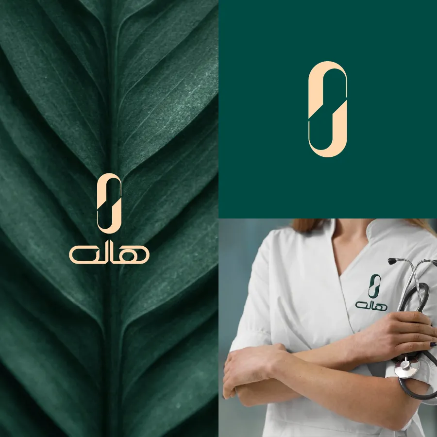
Haleh
BRANDING | PACKAGING | WEBSITE
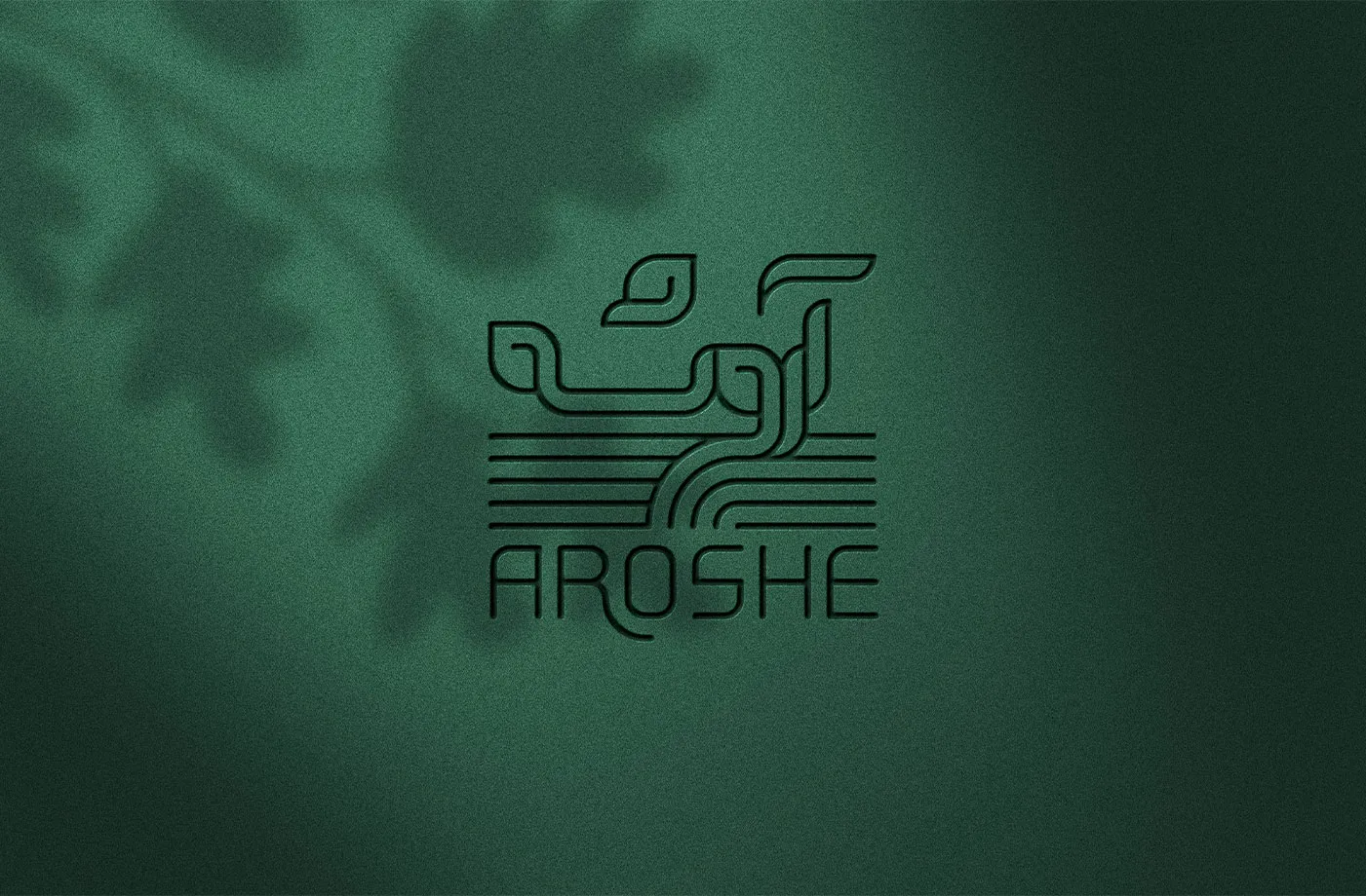
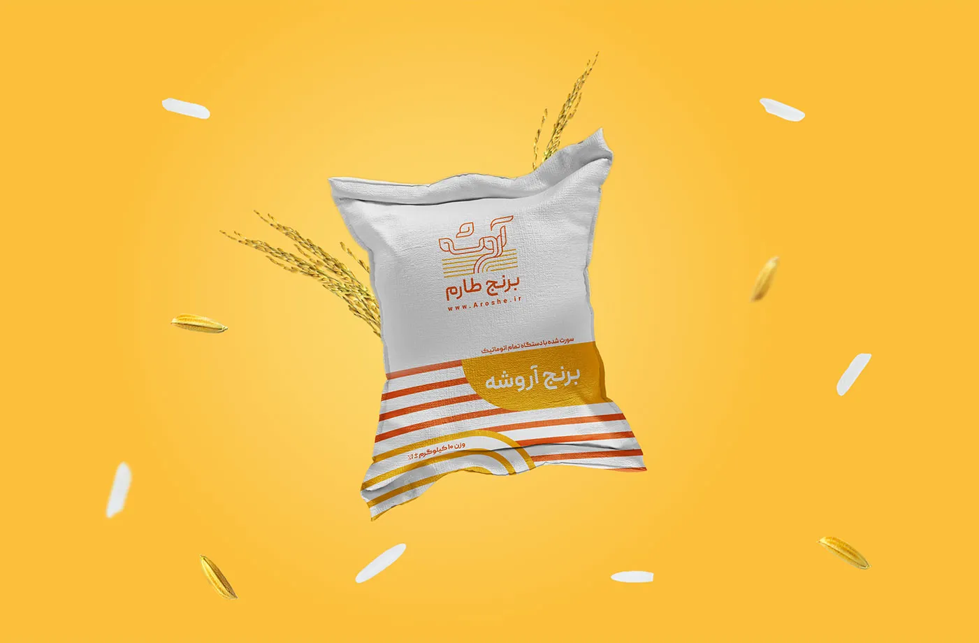
Aroshe’s logo is designed around the concepts of growth, nature, purity, and quality. The visual structure is inspired by agricultural fields and the natural movement of plant growth, creating a sense of life emerging from the land.
The horizontal yellow lines represent cultivated fields and the fertile ground where the product begins its journey. The soft, upward curves suggest growth, movement, and vitality, reinforcing the brand’s connection to nature and natural production.
The rounded corners and continuous linework give the logo a warm, approachable, and trustworthy character. At the same time, the orange and yellow color palette reflects energy, freshness, sunlight, fertility, and the natural quality of the products.
Overall, Aroshe’s logo is more than a visual mark; it tells a simple yet meaningful story of growth from the heart of the land, representing purity, quality, and a deep connection to nature.
Projects
Aroshe
BRANDING | PACKAGING | WEBSITE
ONE
Yes. If your brand already has a logo or visual identity, but you feel that it no longer aligns with your positioning, quality, or business growth, it can be redesigned or refined.
TWO
Yes. If your brand already has a logo or visual identity, but you feel that it no longer aligns with your positioning, quality, or business growth, it can be redesigned or refined.
TREE
Yes. If your brand already has a logo or visual identity, but you feel that it no longer aligns with your positioning, quality, or business growth, it can be redesigned or refined.
FOUR
Yes. If your brand already has a logo or visual identity, but you feel that it no longer aligns with your positioning, quality, or business growth, it can be redesigned or refined.
FIVE
Yes. If your brand already has a logo or visual identity, but you feel that it no longer aligns with your positioning, quality, or business growth, it can be redesigned or refined.
FAQ
?Is a brand’s visual identity only a logo
No. A logo is only one part of a brand’s visual identity, not the whole of it.
Visual identity is a cohesive system of visual elements that helps a brand become recognizable, professional, and distinctive in the audience’s mind. These elements can include the logo, brand colors, typography, imagery style, icons, graphic patterns, layouts, visual tone, social media templates, packaging, stationery, and other brand touchpoints.
In fact, a logo is the starting point of brand recognition, while a complete visual identity helps the brand appear consistent, trustworthy, and professional across all platforms and applications.
?Why does my business need a professional visual identity
A professional visual identity helps a brand appear more serious, trustworthy, and distinctive. In most cases, before people experience the quality of your product or service, they first encounter the visual appearance and overall image of your brand.
If that image feels inconsistent, weak, or unprofessional, the initial trust may not be formed. However, a well-designed and cohesive visual identity can communicate the brand’s message more clearly, strengthen its positioning, and create a better experience for the audience.
Simply put, a strong visual identity does more than make a brand look beautiful; it helps the audience understand the brand better, trust it more, and remember it more easily.
?When should I consider designing or redesigning my brand’s visual identity
If you are experiencing any of the following situations, it may be the right time to design or redesign your brand’s visual identity:
- Your brand has just launched and needs a professional image.
- Your current visual appearance no longer reflects your quality, positioning, or growth direction.
- Your logo or visual elements look outdated, inconsistent, or unprofessional.
- Your website, social media, packaging, or advertising materials lack visual consistency.
- You are planning to enter a new market or attract a more serious and professional audience.
- Your brand has grown, but its visual identity still feels basic or underdeveloped.
- Your audience does not easily recognize or remember your brand.
In these situations, redesigning the visual identity can help the brand present a more accurate, professional, and trustworthy image.
?What is the difference between logo design and visual identity design
Logo design usually focuses on creating the main symbol or mark of a brand. Visual identity design, however, is a broader and more complete system that defines how the brand should appear in different situations.
The logo is part of this system. But visual identity also defines which colors should be used, what the typography should look like, what style of imagery should be followed, how social media posts should be designed, how printed materials should be structured, and how the brand should look consistent across all touchpoints.
So, if we consider the logo as the brand’s signature, visual identity is the brand’s complete visual language.
?What is the process of designing a brand visual identity
The process may vary depending on the needs of each brand, but it usually includes several main stages:
Brand discovery and analysis
Understanding the brand’s goals, audience, values, positioning, and business needs.
Research and competitive analysis
Studying the market, competitors, and visual styles related to the brand’s industry.
Defining the visual direction and initial concept
Establishing the overall design direction, mood, concepts, and visual language of the brand.
Designing the core visual identity elements
Creating the logo, color palette, typography, graphic elements, and other necessary components.
Developing and unifying the visual system
Applying the visual identity across different applications, such as social media, stationery, packaging, or other brand materials.
Final delivery and usage guidelines
Delivering the final files and, if needed, providing visual identity guidelines to help maintain brand consistency.
This process helps ensure that the final result is not only visually appealing, but also purposeful, practical, and scalable.
?Do you provide consultation before starting the design process
Yes. For me, visual identity design is not just about creating a graphic output. Before starting the design process, I aim to understand the brand, its audience, positioning, and business goals more deeply, so that visual decisions are made with clarity and purpose.
In this process, consultation and discussion are an important part of the journey. They help ensure that the final design is aligned with the real needs of the brand, rather than being based only on personal taste or short-lived trends.
?Is it possible to redesign an existing brand visual identity
Yes. If your brand already has a logo or visual identity, but you feel that it no longer aligns with your positioning, quality, or business growth, it can be redesigned or refined.
Redesigning does not always mean changing everything completely. Sometimes, the existing identity can be preserved while being made more professional, cohesive, and up to date. In other cases, the brand may need a more significant change to create a new image in the audience’s mind.
The level of change is determined after reviewing the brand’s current situation, future goals, and business needs.
?Does visual identity affect sales and brand growth
Visual identity alone cannot replace product quality, marketing strategy, or a good customer experience. However, it plays a very important role in shaping first impressions, building trust, and making the brand more memorable.
When a brand appears consistent, professional, and recognizable, the audience is more likely to trust it and engage with it seriously. Over time, this can influence the brand’s credibility, positioning, and even the audience’s purchase decisions.
A strong visual identity makes the communication between the brand and its audience clearer and more professional.
?Is it possible to design only a logo
Yes. However, before making that decision, it is better to evaluate whether a logo alone is enough for the brand’s current needs.
In some projects, logo design can be a good starting point. But if the brand appears across different platforms such as a website, social media, packaging, advertising, or printed materials, having only a logo is usually not enough. In that case, a more cohesive visual system is often needed.
The goal is to make sure the design outcome is aligned with the brand’s real needs and can practically support the brand’s growth and visual consistency.